Creating an Interactive Choropleth Map & Bar Chart for Statistics Indonesia Poverty Data Using Dash
Chapter 1: Background Story
Poverty is a universal scourge that affects all countries, including Indonesia. The challenging geographical conditions in Indonesia can make it difficult to track poverty levels. Fortunately, Indonesia has an institution whose main function is to collect, compile, and publish statistical data on all aspects of Indonesian life, including poverty.
It’s called Statistics Indonesia.

The data that they published are mostly in a tabular form. Analyzing poverty data in a tabular form can be daunting, especially when there is a large amount of data. This makes it difficult to identify patterns and trends. Therefore, I will create a visualization of the data to make it easier to identify patterns and trends. This can lead to new insights and discoveries.
Plus, data visualizations are more engaging and visually appealing than tabular data, which can make them more effective for communicating data to others.
Chapter 2: Technical Approach
2.1 Data Cleaning Process
I downloaded the data manually from the website in excel form.
When I first saw the structure of the data, I found it would be difficult for me to process them. Therefore, I created a program to transform them into the structure that I wanted and to compile them since they were stored in more than one file.
In this part, I won’t explain the algorithm details. It will only be a demo.
2.2 Install Necessary Modules
Next, there are two modules we need to install
2.2.1 Dash
Run below command:
python -m pip install dash2.2.2 Pandas
Run below command:
python -m pip install pandas2.3 Download GeoJSON Data
GeoJSON is a data format for encoding a variety of geographical features and their nonspatial attributes. It is based on the JSON format, and it is used to represent geographical data such as points, lines, polygons, and multi-part collections of these shapes.
I downloaded the GeoJSON data from this site.
2.4 App Creation
First, let’s import necessary modules.
import pandas as pd # will be used to read and manipulate our data
import plotly.express as px # will be used to create the data visualization
import json # will be used to convert GeoJSON data plain text into JSON format

from dash import html, dcc, Dash, Input, Output # the core of the app
Next, create a Dash app instance.
app = Dash(__name__)Read the poverty data.
data = pd.read_excel("C:\\Projects\\Data\\education_and_wellfare\\Persentase_Penduduk_Miskin_Compiled_2022.xlsx",
                     header=[0, 1], index_col=0)
Recreate Province column.
data["Province"] = [province.title() for province in data.index.tolist()]Load and convert GeoJSON data into JSON format.
geojson_data = json.load(open("data/indonesia.geojson", 'r'))Create the Dash app layout.
The layout is based on HTML file structure, and need to be constructed within an array inside html.Div().
Below is the code snippet for the layout:
app.layout = html.Div(
    [
        html.H1("Indonesian Poverty Data", style={"text-align": "center"}),
        dcc.Graph(id="more_than_10_percent_poor_residents", figure={}),
        html.Hr(),
        dcc.Graph(id="poor_residents_map", figure={}),
        html.Br(),
        dcc.Slider(min=2015,
                   max=2022.5,
                   step=0.5,
                   marks={
                       2015: "2015",
                       2015.5: "",
                       2016: "2016",
                       2016.5: "",
                       2017: "2017",
                       2017.5: "",
                       2018: "2018",
                       2018.5: "",
                       2019: "2019",
                       2019.5: "",
                       2020: "2020",
                       2020.5: "",
                       2021: "2021",
                       2021.5: "",
                       2022: "2022",
                       2022.5: ""
                   },
                   value=2015,
                   id="time-slider",
                   className="margin10")
    ]
)- Html.H1() is the header
- Dcc.Graph() is the graph container.
- Figure attribute will act as the placeholder to receive a graph from the callback (we’ll talk about it in the next section) - Html.Hr() is a horizontal line. It’s usually used to separate two blocks.
- Html.Br() is a new line break.
- Dcc.Slider() is a slider for users to interact with.
- Min is used to set a minimum value for the slider
- Max is used to set a maximum value for the slider
- Step is used to define a value with which the range between Min and Max will be divided evenly
- Marks is used to define a description that is visible to users
- Value is a default value
Next, we are going to create a callback function that will be triggered when users interact with the slider, and then automatically update the data viz using a decorator called @app.callback.
When users interact with the slider (or any interactive interface) the @app.callback will be triggered and then run the function beneath it.
Below is the code snippet of the callback function:
@app.callback(
    [Output(component_id="more_than_10_percent_poor_residents", component_property="figure"),
     Output(component_id="poor_residents_map", component_property="figure")],
    Input(component_id="time-slider", component_property="value")
)
def update_graph(param):
    year = str(param).split(".")[0]
    semester = "Semester 2 (September)" if len(str(param).split(".")) > 1 else "Semester 1 (Maret)"
    copied_data = data[:34].copy()

    fig_top_ten = px.bar(
        copied_data,
        x=copied_data[data[year][semester].apply(lambda x: x > 10)].sort_values(by=(year, semester),
                                                                                ascending=False)["Province"],
        y=copied_data[data[year][semester].apply(lambda x: x > 10)].sort_values(by=(year, semester),
                                                                                ascending=False)[year][semester],
        color=copied_data[data[year][semester].apply(lambda x: x > 10)].sort_values(by=(year, semester),
                                                                                    ascending=False)[year][semester],
        text=copied_data[data[year][semester].apply(lambda x: x > 10)].sort_values(by=(year, semester),
                                                                                   ascending=False)[year][semester],
        color_continuous_scale=["orange", "red", "black"],
        labels={"x": "Province", "y": ">10% of Poor Residents", "color": "%"}
    )

    fig_top_ten.update_layout(
        height=300,
        margin={'r': 300, 'l': 300, 'b': 0}
    )

    fig_map = px.choropleth_mapbox(
        data_frame=copied_data,
        geojson=geojson_data,
        locations="Province",
        featureidkey="properties.state",
        color=copied_data[year][semester],
        labels={"color": "%"},
        color_continuous_scale='YlOrRd',
        mapbox_style='carto-positron',
        zoom=4,
        center={'lat': -2, 'lon': 118}
    )

    # Remove the edges
    fig_map.update_traces(marker={"line": {"width": 0}})

    fig_map.update_layout(
        height=500,
        margin={'r': 300, 'l': 300, 'b': 0}
    )

return fig_map, fig_top_ten- The Output in the decorator needs to be defined within an array if we are going to return more than one object.
- The component_id and the component_property in both Output and Input in the decorator need to match with the id from the graph container (dcc.Graph()) and the slider container.
- Bar chart instance is defined with the fig_top_ten = px.bar()
- Choropleth Map instance is defined with the fig_map = px.choropleth_mapbox()
- Data_frame needs to be filled with the data we are going to use to create the choropleth
- Geojson needs to be filled with the geojson we already convert into JSON format.
- Locations is used to specify the geographic locations of the data points to be plotted. Here I’m using the newly created column name from my data, that is Province.
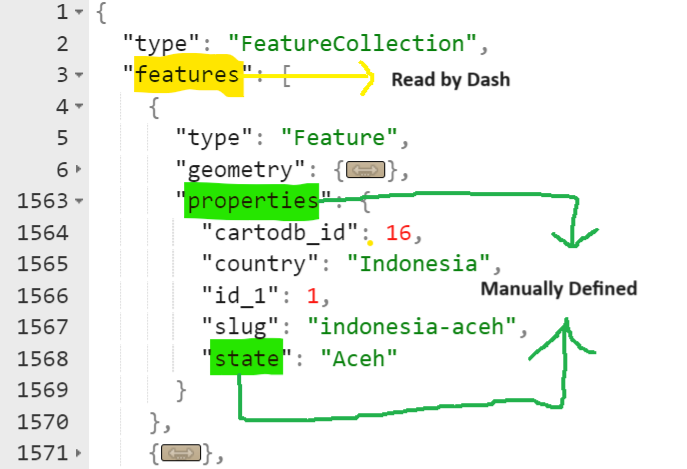
- Featureidkey needs to be filled with value in the Geojson that matches with the value in the Locations. The structure of geoJSON data is shown by the picture below. Dash, somehow, already read the features field by default and we only need to state the direction where should Dash read the value next.
Last, we route the whole application so that if we run it directly, the Dash application will run
if __name__ == "__main__":
    app.run_server()